
Cymbal Design System
The Problem:
At Google, Demos are valuable sales and marketing tools. The issue is they are time consuming to create. The current landscape of demos is scattered, producing duplicative assets with divided formats and conventions- using resources inefficiently and leaving Google vulnerable to legal and compliance issues.
The Opportunity:
Create a toolkit for content creation that instantly ramps up demo builds without the need to worry about legal, compliance, domain registration or design standards allowing teams to build beautiful experiences faster in a cohesive manner.
Role:
Creative Director
Lead UX Designer
Hello World.
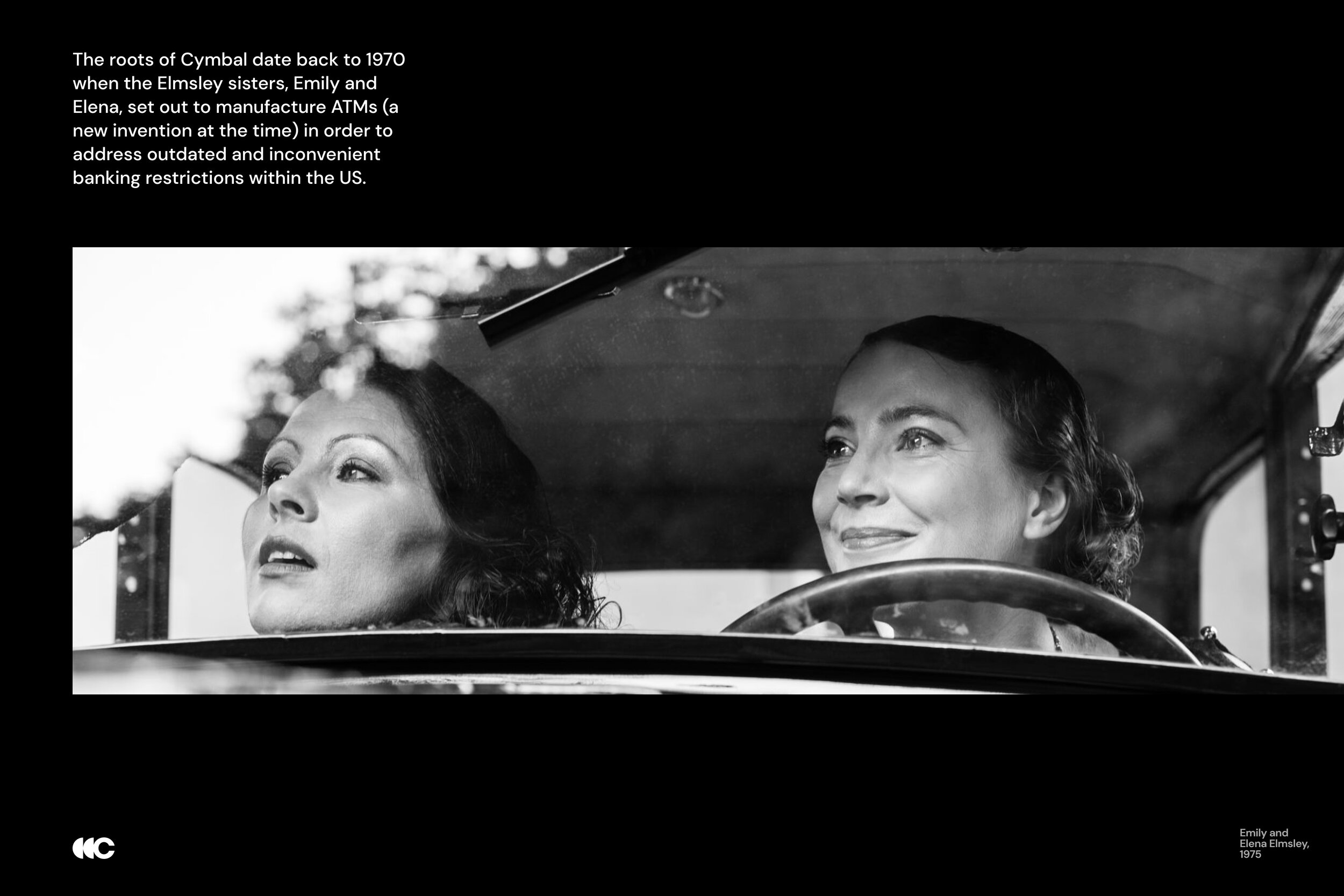
Cymbal is a fictitious holding company created to tell a variety of stories about Google Cloud's products and solutions.
It has subsidiaries operating in key focus areas for Cloud (Retail, FSI, HCLS) and facing many of the critical business challenges that we’re best positioned to solve. Each subsidiary is inspired by real-world references and includes a snapshot of employees – inspired by real-world clients – to serve as the foundation for storytelling. Cymbal and its businesses are growing fast, enabled by the transformative capabilities of Google Cloud.
Sound too good to be true? You're right. Cymbal's structure, story, and brand identity were carefully designed to make Google Cloud’s demo and pitch content shine.
The Cymbal toolkit aims to provide demo builders with resources for better content creation – increasing efficiency, consistency, quality, and compliance.

Typography
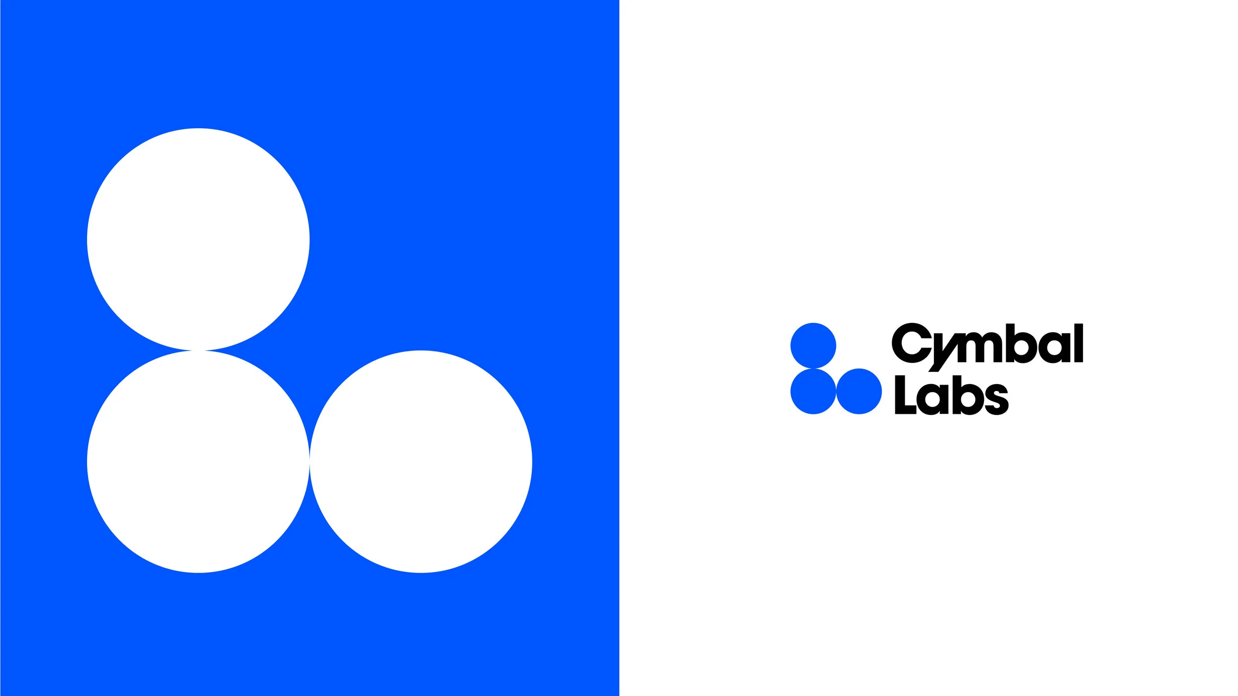
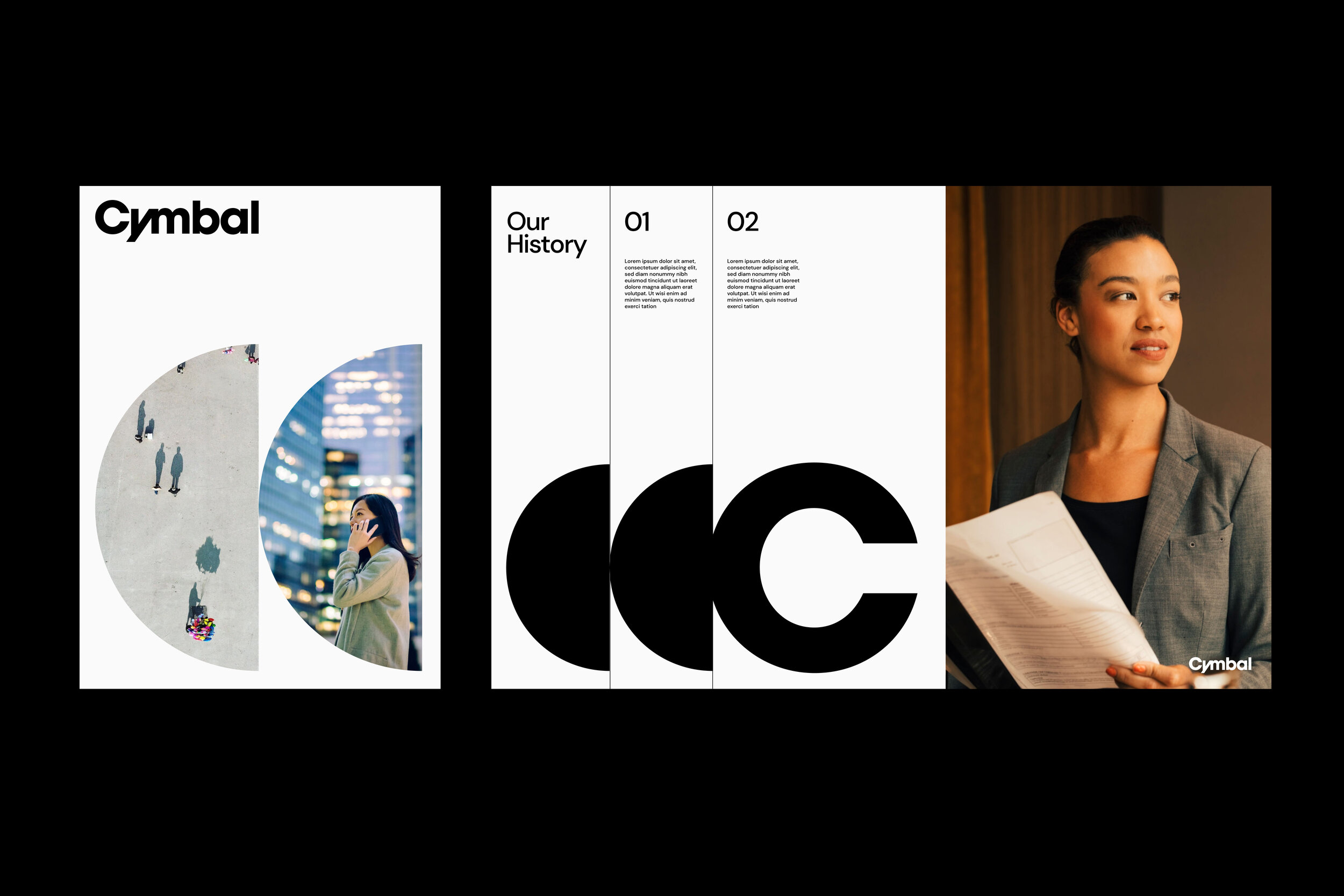
We use Avant Garde Bold as the basis for the Cymbal word mark and the subsidary lockups.
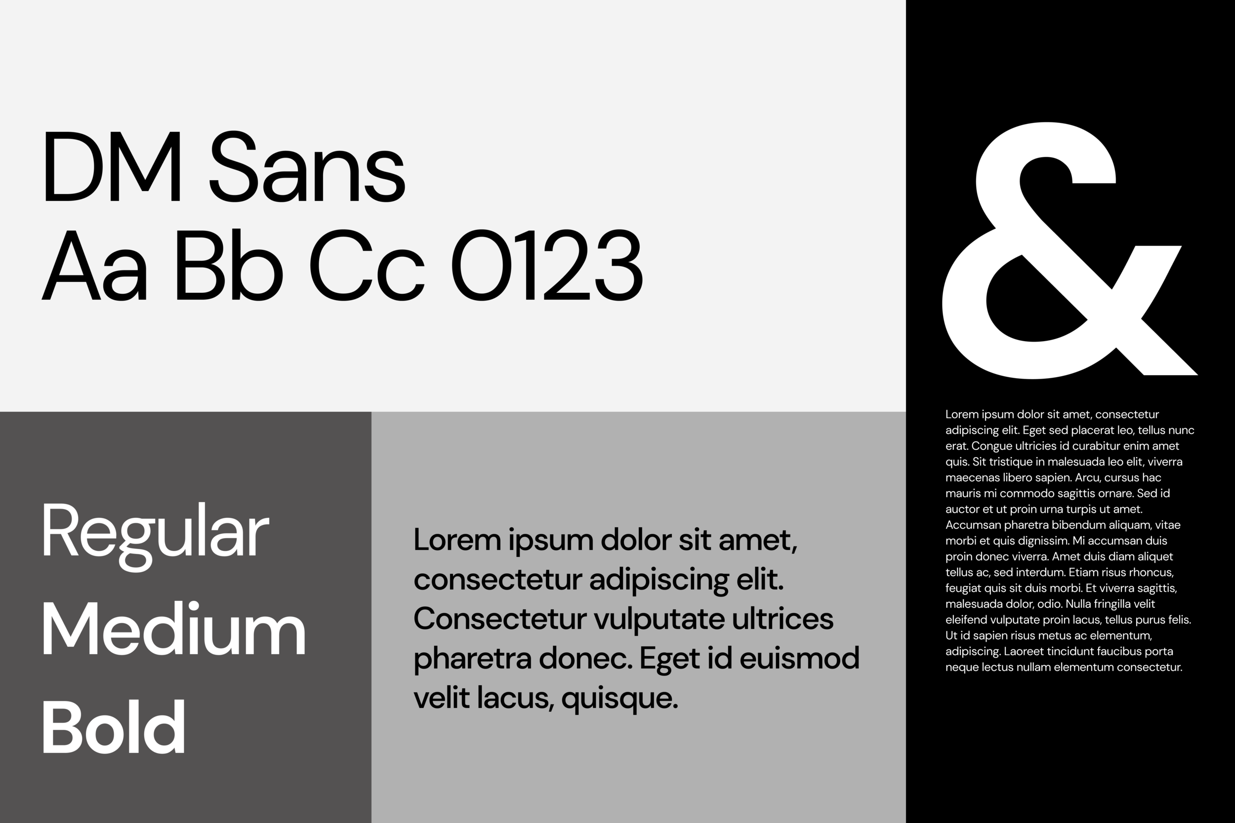
We use DM Sans for all our typography. It is a geometric sans-serif typeface with a friendliness that resonates with our wordmark. Because of the low contrast within each letterform, it is highly legible at small sizes—while its quirks allow it to maintain its personality at display sizes.


Color Palette and Shape
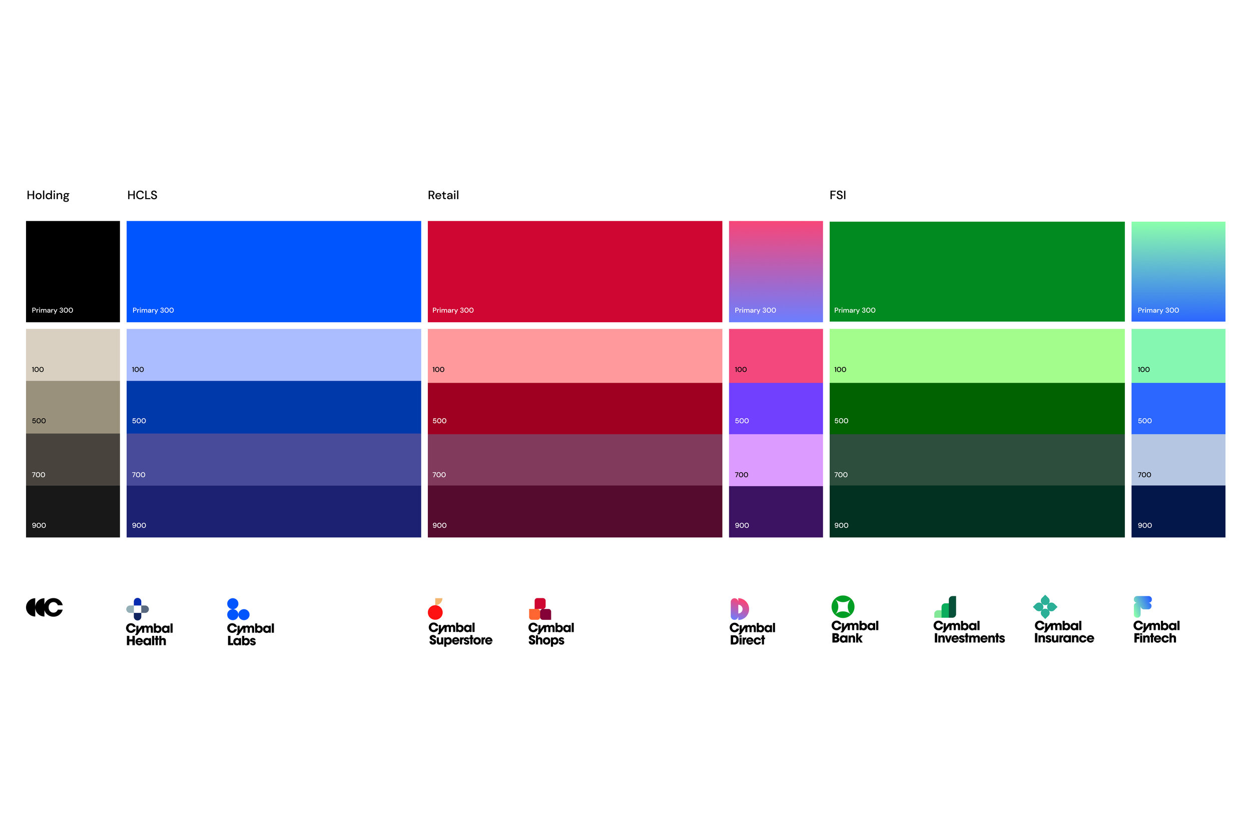
Our color palette and shape is an expansive library that can accommodate future design developments of our subsidiaries.
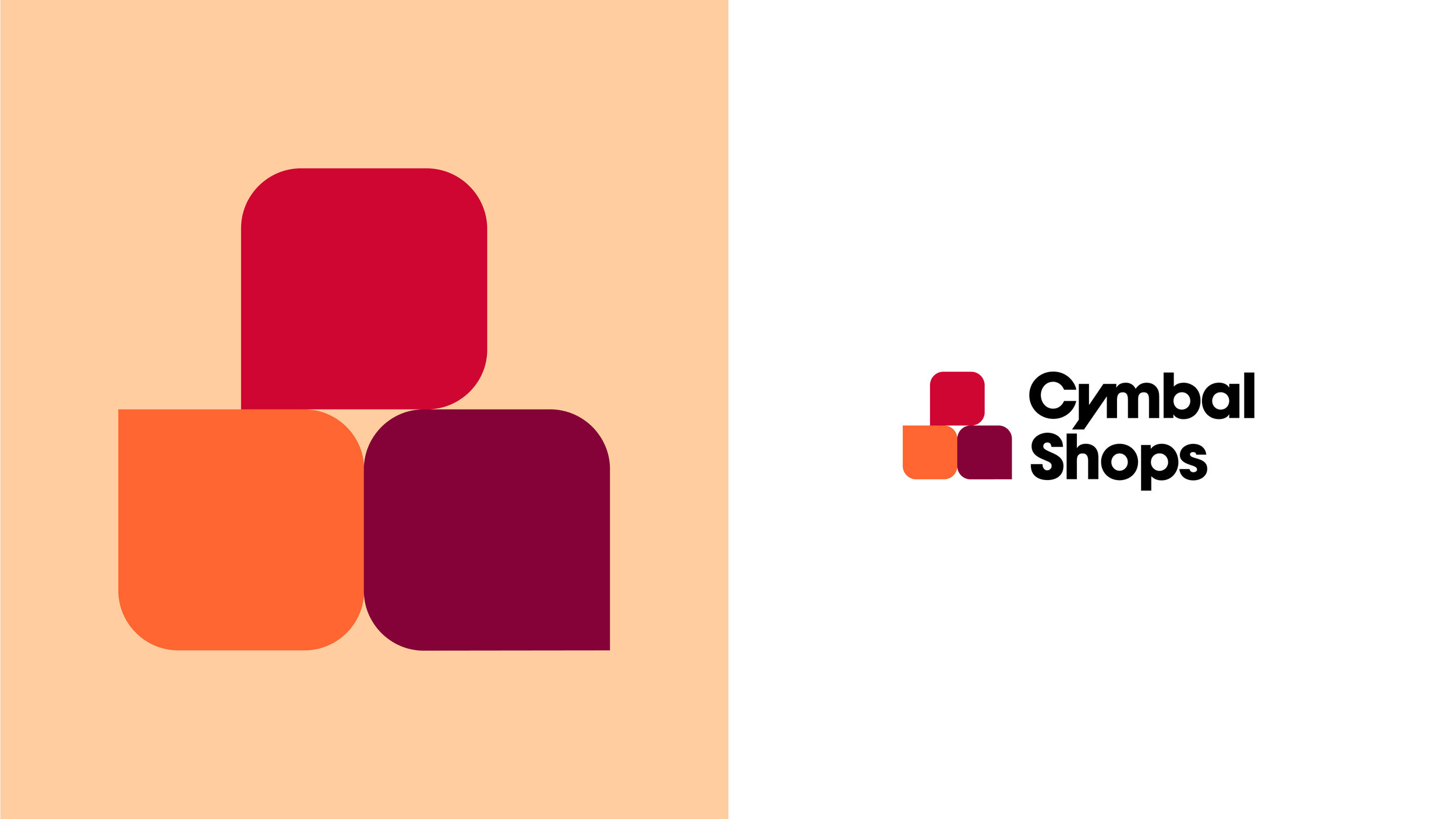
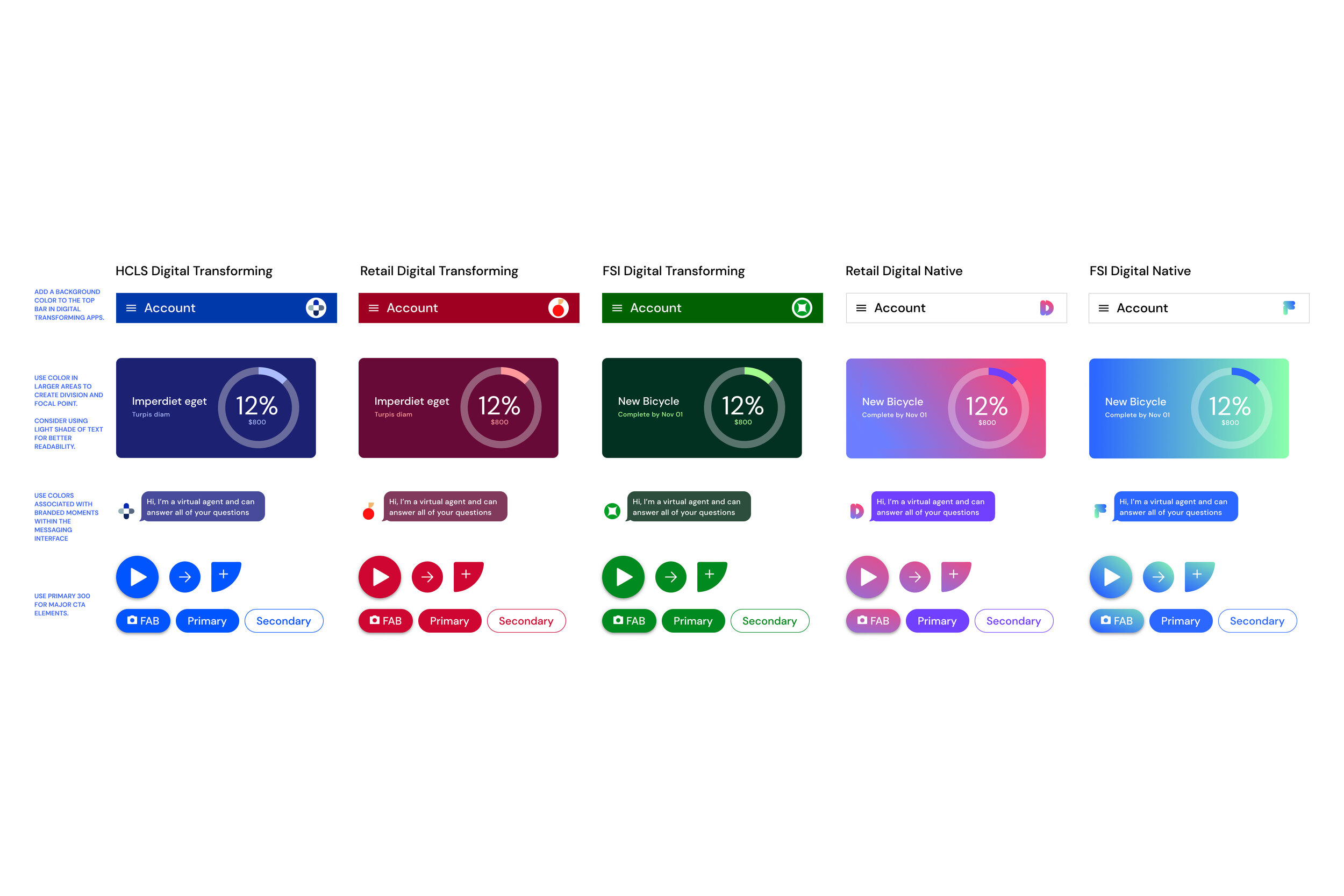
Each industry has been assigned a core color. For example, subsidiaries within HCLS own blue as their unifying color, Retail subsidiaries own red, and FSI subsidiaries own green.
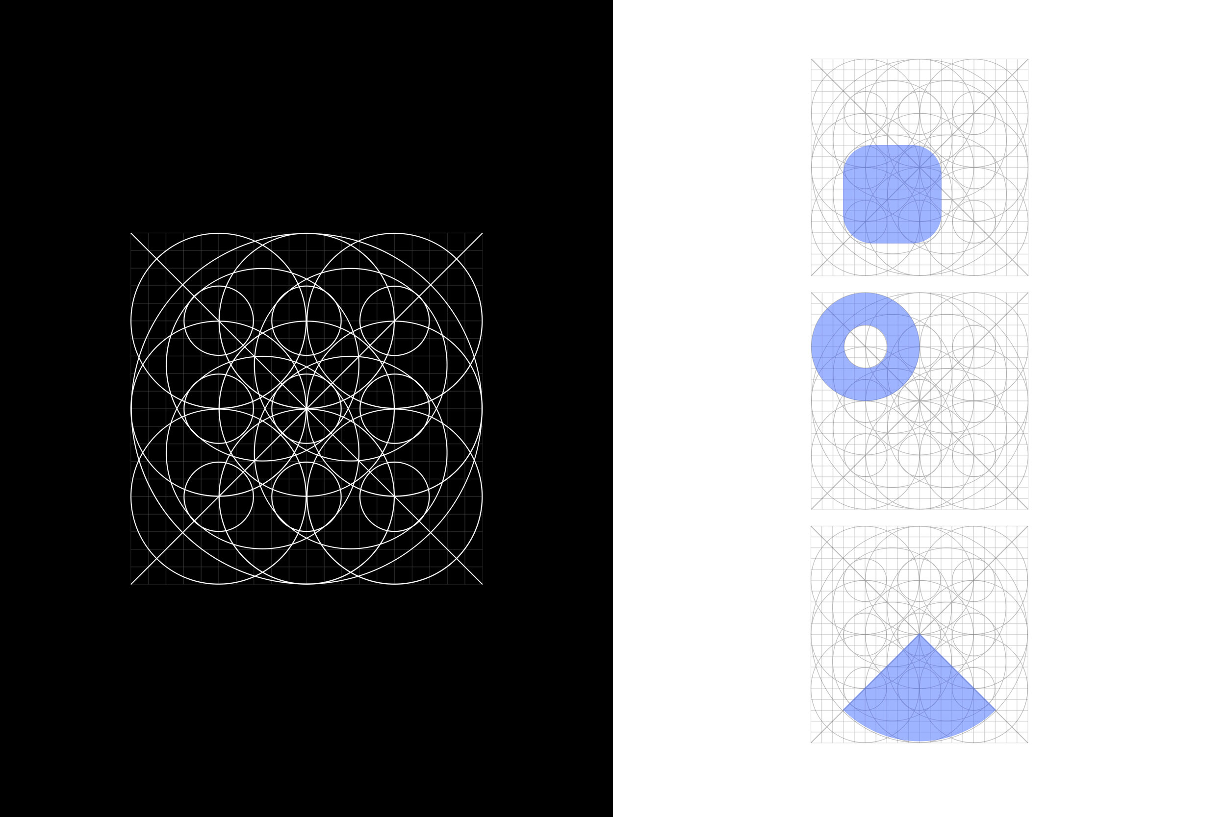
Our shapes for subsidiary development are grounded in a unifying grid creating consistency and a baseline for future production.






Baseline UI Elements
It all begins with an idea. Maybe you want to launch a business. Maybe you want to turn a hobby into something more. Or maybe you have a creative project to share with the world. Whatever it is, the way you tell your story online can make all the difference.

System Application
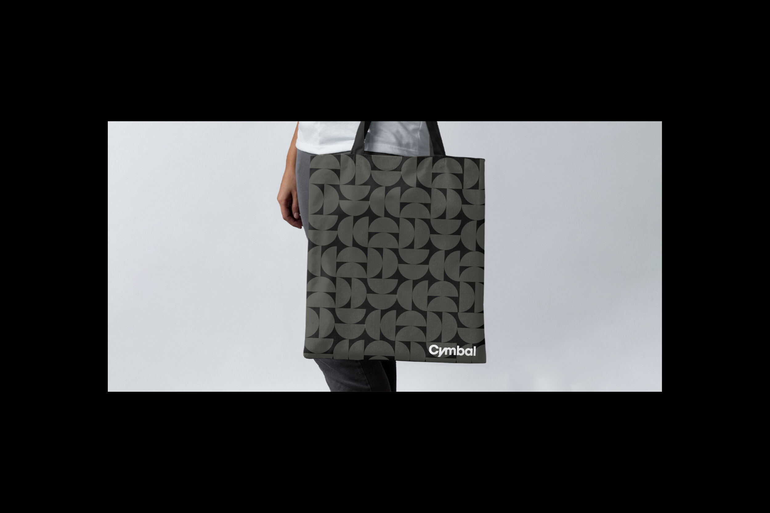
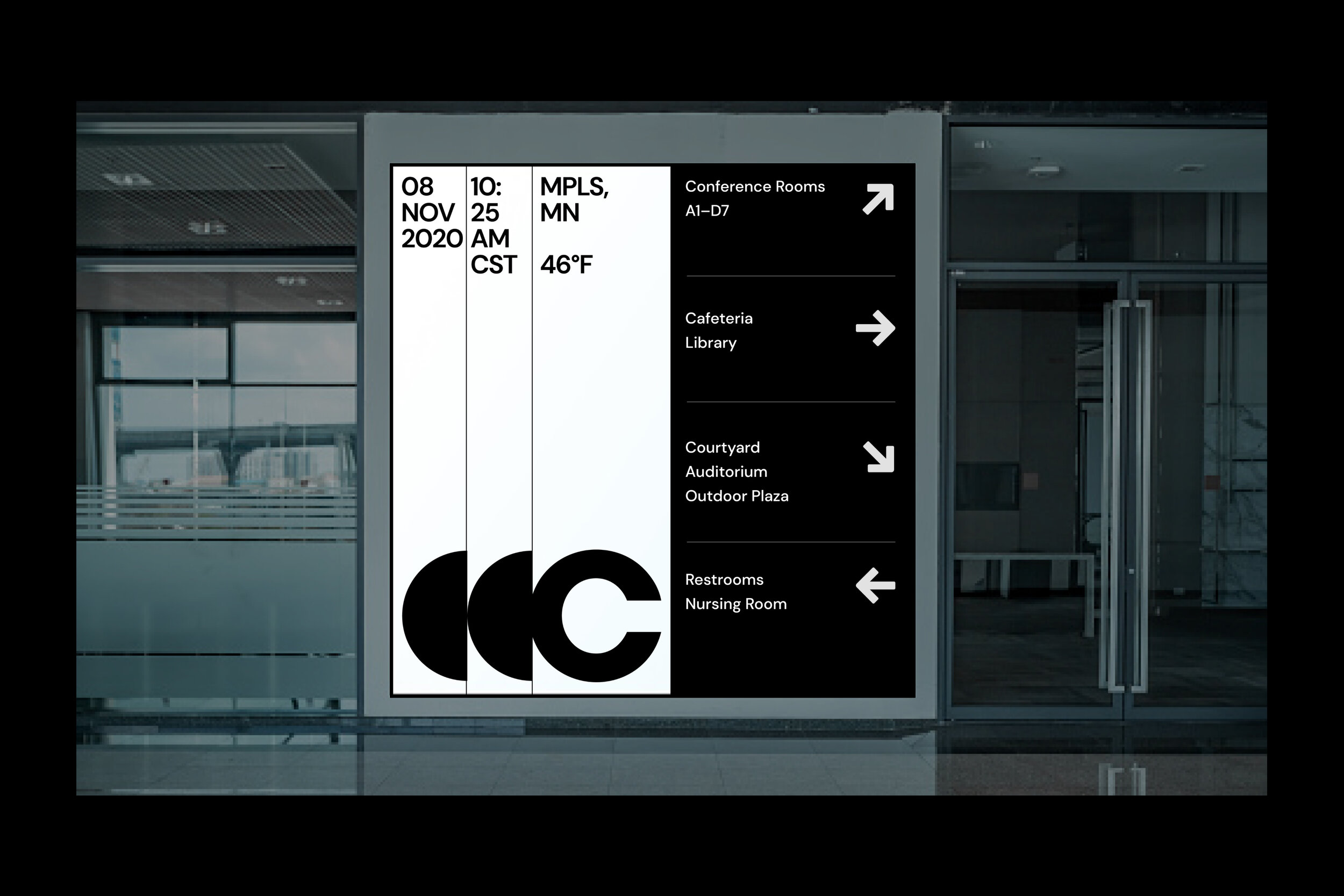
Combining the baseline elements of Cymbal allows teams to build beautiful experiences faster while elevating the Google Cloud Demo brand.
Coming soon.





Making the system accessible to empower teams
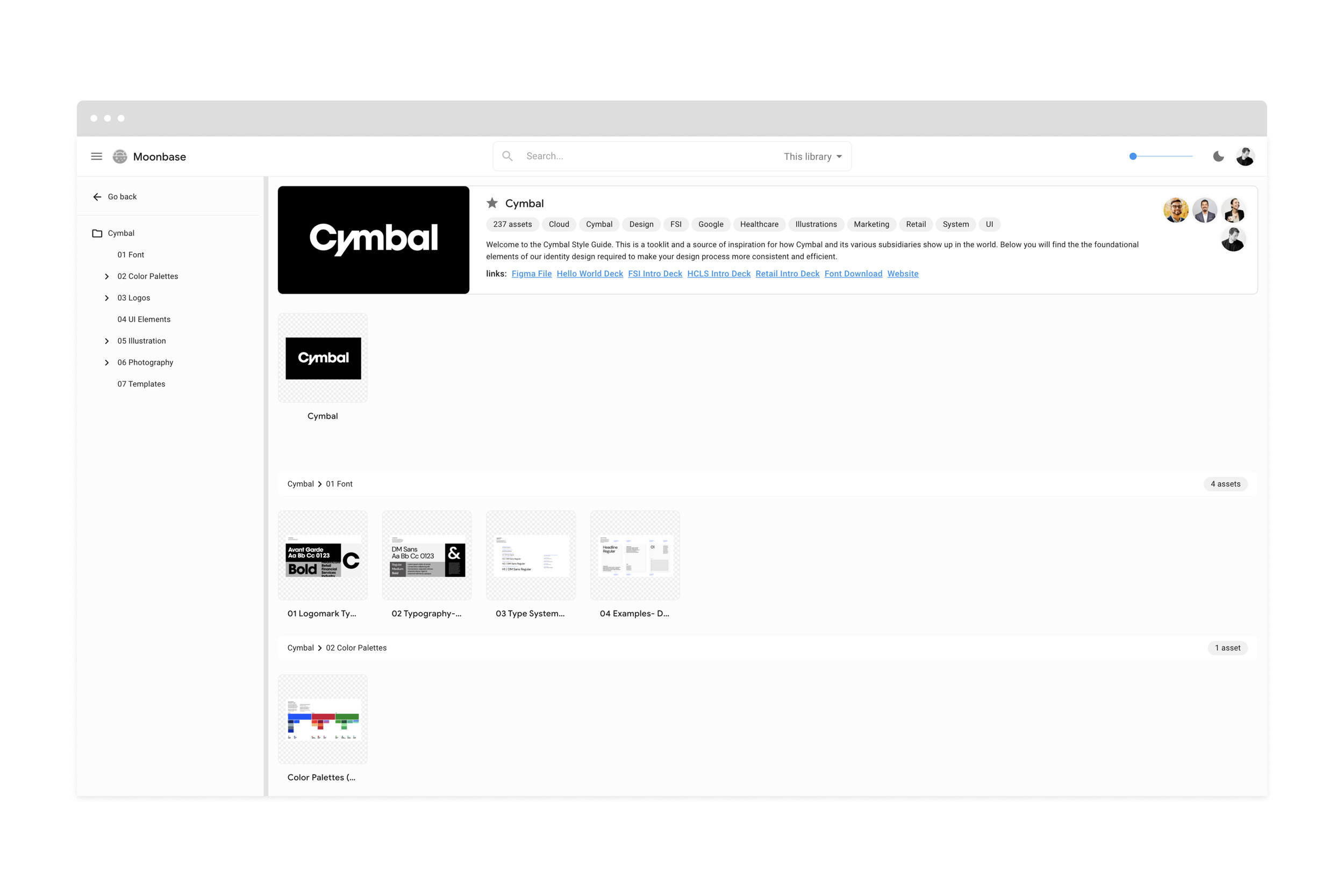
Once the system was created our job was communicate, educate and share the designs with all the teams that could utilize them. We set up guidelines on standards.google.com, the internal library tool Moonbase and added it as a library within the Google Figma workspace.
In addition to making it widely accessible on these platforms we constructed several education documents and workbooks on the granular details of adding assets to the library and the specifics that come along with subsidiaries. (Personas/ data sets etc.)


A design system, built remotely.
Cymbal is a fictitious holding company created by the Google Demo Experiments & Experiences team and a large group of collaborators including the agency partner RedScout and the Google Cloud Solutions Studio team.
One design system built entirely remote across several time zones.

